Colour temperature is the decision in a lighting specification that is hardest to correct once the ceiling is closed. For commercial interiors the working defaults are simple: 3000K for hotel guest rooms, restaurants and lounges; 4000K for offices, back-of-house and task areas; 3500K where a project needs one compromise value across both. The rest is refinement. This guide explains what the Kelvin number describes, how 2700K to 6500K read in a real room, how to map colour temperature to space types, what goes wrong when values are mixed, and how to keep a project to a small number of white-light settings.
What Colour Temperature Actually Measures
Kelvin, CCT and white light
Colour temperature describes the appearance of white light, not its brightness and not its quality. The scale is borrowed from the behaviour of a heated object: a low Kelvin number describes light that looks orange-white, and a high number describes light that looks blue-white. LED sources are not heated filaments, so the correct term for them is correlated colour temperature, abbreviated CCT. When a supplier writes 3000K on a data sheet, it means the light output sits at that point on the white-light scale, within a stated manufacturing tolerance.
Why two LEDs at the same CCT can look different
CCT alone does not fix appearance. Two 4000K fittings from different production batches can sit at opposite ends of the allowed tolerance, and side by side the difference is visible even though both are labelled correctly. Check the tolerance the supplier works to and ask whether one batch can cover a whole floor. On a phased project, hold a reference sample and compare deliveries against it rather than against memory.
2700K, 3000K, 3500K, 4000K, 5000K and 6500K Compared
The steps are not evenly spaced in perception: the jump from 3000K to 4000K is far more visible than the jump from 4000K to 5000K.
| CCT | Appearance | Reads as | Typical commercial use |
|---|---|---|---|
| 2700K | Warm white | Candle-like, amber undertone, cosy | Boutique guest rooms, lounge bars, spa areas |
| 3000K | Warm white | Soft but clean, flattering to skin and timber | Hotel guest rooms, restaurants, corridors, lobbies |
| 3500K | Neutral warm | Neither warm nor cold, slightly clinical at low level | Mixed-use lobbies, retail with people and merchandise |
| 4000K | Neutral to cool white | Crisp, neutral, task-oriented | Offices, meeting rooms, kitchens, back-of-house |
| 5000K | Cool white | Bright, clinical, casts shadows harder | Laundry, plant rooms, covered loading zones |
| 6500K | Daylight | Strong blue cast, often industrial indoors | Service yards, exterior task lighting |
Two cautions follow. Warm values hide dust and marks on ceilings better than cool values do, which is why back-of-house and service corridors in a hotel usually take a cooler fitting than the guest floors above. High values also make skin tones look grey, so 5000K or 6500K in a dining or retail space should be justified rather than inherited.
Mapping Colour Temperature to Space Type
Building the schedule
Map the space, not the fixture. Work through the floor plate by function and assign one value per function before looking at product: guest rooms, corridors, lobby, restaurant, bar, meeting rooms, offices, WCs, back-of-house and external areas.
| Space | Recommended CCT | Reason |
|---|---|---|
| Hotel guest room | 3000K | Low light levels; warmer light suits timber and textiles |
| Guest corridor | 3000K | Continues the guest-room feel outside bedroom doors |
| Lobby and reception | 3000-3500K | Flatters people and finishes while reading as a commercial space |
| Restaurant and bar | 2700-3000K | Food and skin tones suit warmer light; table lamps can sit at 2700K |
| Office and meeting room | 4000K | Higher light levels and concentration tasks suit a neutral value |
| Kitchen and back-of-house | 4000-5000K | Inspection tasks; cooler values reveal dirt and damage |
| Retail | 3000-3500K by merchandise | Cooler values suit technology, warmer values suit apparel |
| External and service yards | 4000-6500K | Distance and night adaptation favour cooler light; check local rules |
Zones that read as one space
Vestibules, open staircases and double-height atriums break schedules, because they are visually one space but functionally two. Give these zones one value for the whole visual volume and let light level, not colour temperature, create the hierarchy. If two values are unavoidable, put the transition at an architectural break such as a soffit edge or a doorway, never where a visitor is standing.
What Happens When You Mix Colour Temperatures in One Space
Visible mismatch and how it appears
Mixing is a mistake because the eye compares, not because the numbers conflict. Two whites side by side always look more different than either looks alone, and the warmer one usually looks dimmer and dirtier than it is. The mismatch is worst on plain surfaces, such as a white ceiling carrying two fitting types, where a warm and a cool patch can be read from the doorway.
Replacement and renovation risk
The second source of mismatch is time. A fitting replaced two years later may carry the same nominal CCT and a slightly different phosphor mix, so the repaired row no longer matches its neighbours. Reduce that risk by keeping a stock of the specified fitting for the life of the installation, by recording the batch reference in the operation and maintenance manual, and by replacing fittings in rows rather than individually where the ceiling is visually continuous.
Colour Temperature, Colour Rendering and Light Level
Rendering is a separate specification
Colour temperature says how white the light looks; colour rendering says how faithfully objects look under it. The usual measure is the colour rendering index, commonly written as Ra. High Ra does not substitute for a good CCT decision, and a good CCT does not rescue poor rendering. For hotel, restaurant and retail work, ask about the red rendering component of the index, which governs how meat, timber and skin tones appear. Keep both on the same specification sheet.
Why warmer light suits lower levels
In practice the two work as a pair: at low light levels a cooler source tends to read harsh and unwelcoming, and at high light levels a warm source tends to read dim and heavy. That is why dimming and colour temperature belong in the same conversation. A room specified at 4000K and then dimmed to a small fraction of its output can feel institutional, and the same room at 3000K can feel under-lit when the space has to work hard. Where one colour temperature runs across a range of light levels, treat the dimming range as part of the specification.
Using Tunable Three-Colour LED Fixtures
How three-colour switching works
A three-colour fitting carries more than one white light source inside the same housing, and a driver or switch selects which one is lit, or mixes them, to give fixed settings such as warm, neutral and cool. Most commercial fittings of this type give a small number of fixed settings rather than a continuous range, so the practical question is which settings a space needs, not how finely it can be tuned.
Where tunable CCT earns its place
Tunable colour temperature is a working tool, not a feature to add by default. Hotel rooms benefit most: the same fitting can deliver a warm evening setting, a neutral setting for reading, and a brighter cooler setting for housekeeping. Meeting and event spaces that change character through the day are the next best case. Corridors, back-of-house and car parks rarely need it, and tunable fittings there simply create settings staff never use. Where they are specified, commission and label the settings so the choice is not left as three anonymous clicks on a remote.
How Many Colour Temperatures Should One Project Use
The working limit
Aim for two values across a project and treat three as the absolute maximum. A split that works well is 3000K for guest-facing and dining spaces and 4000K for offices, kitchens and back-of-house. Front-of-house and back-of-house is a natural fault line because it follows a wall or a door rather than a sightline, and staff accept the change immediately. Write both values into the drawing title block and the purchase schedule, so a contractor cannot substitute a fitting with a different CCT without the change being visible on paper.
Values to keep out of the schedule
Avoid 2700K and 3000K in the same open area, avoid any mix of 4000K and 5000K where customers sit, and avoid 6500K indoors outside genuinely technical spaces. Where an existing installation already mixes values and cannot be corrected, treat the surface first: repainting a patch of ceiling or adding a cove detail is often less disruptive than replacing fittings. If the mismatch sits between two fitting types rather than two rooms, check the drivers before replacing anything, since a replacement driver specified at the wrong point on the white scale reproduces the original fault.
Specifying Colour Temperature: A Practical Checklist
Confirm the CCT for each space on the schedule and the boundary where it changes. Confirm the batch tolerance policy and whether one batch can cover a floor. Confirm that dimming and colour temperature have been considered together for every space where the light level will vary. Confirm the red rendering point with the supplier if the space is guest-facing. Confirm the maintenance manual records the CCT and batch of every fitting type, so future replacements match. Finally, confirm the fitting type can be supplied consistently across a phased handover, because hallway-by-hallway openings are where most colour drift appears.
We manufacture commercial light fittings in Guzhen, Zhongshan and support custom dimensions, materials, finishes and the colour temperature required for each zone of a project. There is no minimum order, lead time is typically 15 to 30 days, and every unit carries a three-year manufacturer warranty. Review surface-mounted ceiling lights and pendant lights for guest and dining areas, then send your room schedule and the required CCT for each space through the contact page or WhatsApp +86 180 2480 4499 for a quotation.
About the author : hy-tanya@hotmail.com

Related posts
Popular products
-
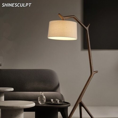 FL-013 Solid Wood Floor Lamp
Price range: $465.38 through $589.62
-
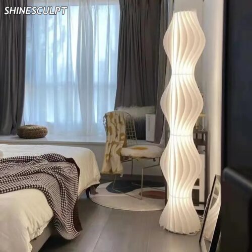 FL-012 Grass Skirt Floor Lamp
Price range: $34.62 through $62.31
-
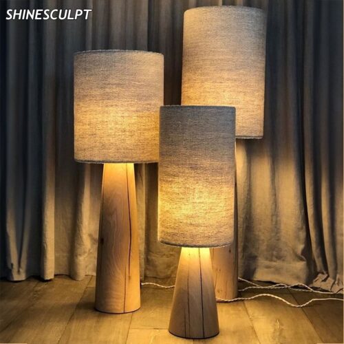 FL-011 Wabi-Sabi Floor Lamp
Price range: $500.00 through $576.92
-
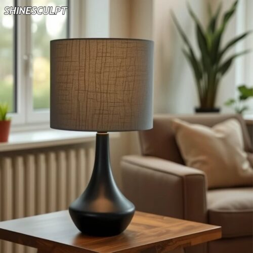 TL-006 Fabric Shade Bedside Lamp
$95.00